myGNV and super advantages
The Loyalty Program is Renewed with a New Style
Discover the renewed face of myGNV, where loyalty becomes even more engaging and dynamic.
Client
- GNV
Year
2024
Industry
- Ferries
- Tourism
Partner
Day One S.r.l.
Eugenio Di Salle
Maria Ester Arena
Category
Brand Strategy, CRM
Tag
Adv Campaigns, Adv Materials, Art Direction, Brand Design, Copywriting, Corporate Image, Creative Direction,
The Challenge
The myGNV project represents an important milestone for GNV, with the goal of strengthening the bond with its customers through a loyalty program that is renewed in both image and content. myGNV 2024 edition allows passengers to earn even more points by traveling, obtaining discounts, and exclusive benefits. Every euro spent on purchasing tickets turns into points, making every journey an opportunity to earn.
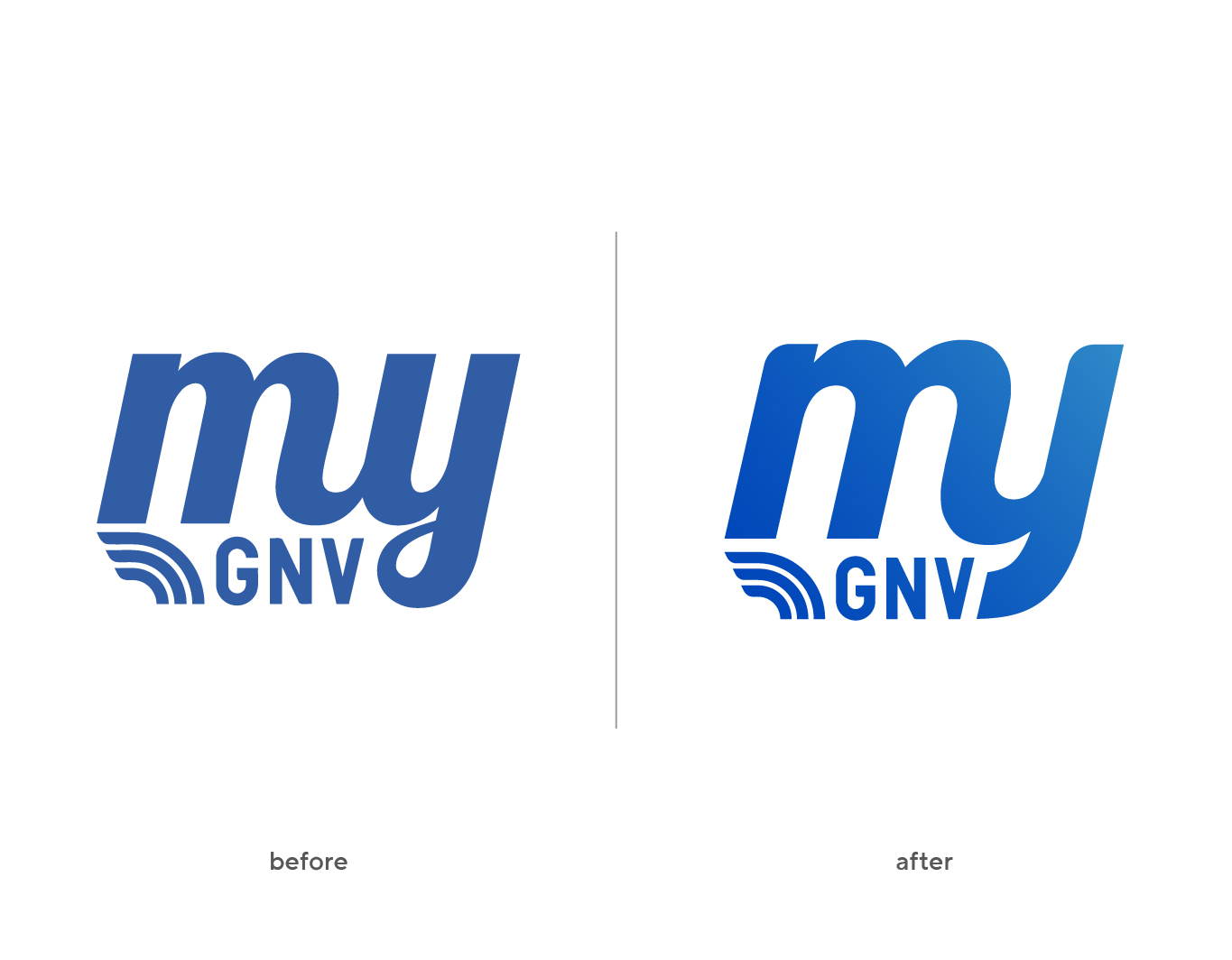
GNV contacted us with the need to carry out a light restyling of the logo and develop a new key visual for the relaunch of the myGNV program. The challenge was to renew the visual identity of the program while maintaining the recognizability and trust built over the years, and to create a visual impact that would attract and engage customers, both old and new, highlighting the benefits of the loyalty program.
How we approached it
We started with a light restyling of the myGNV logo, retaining the fundamental elements to ensure continuity and recognizability, but with a modern and appealing touch.
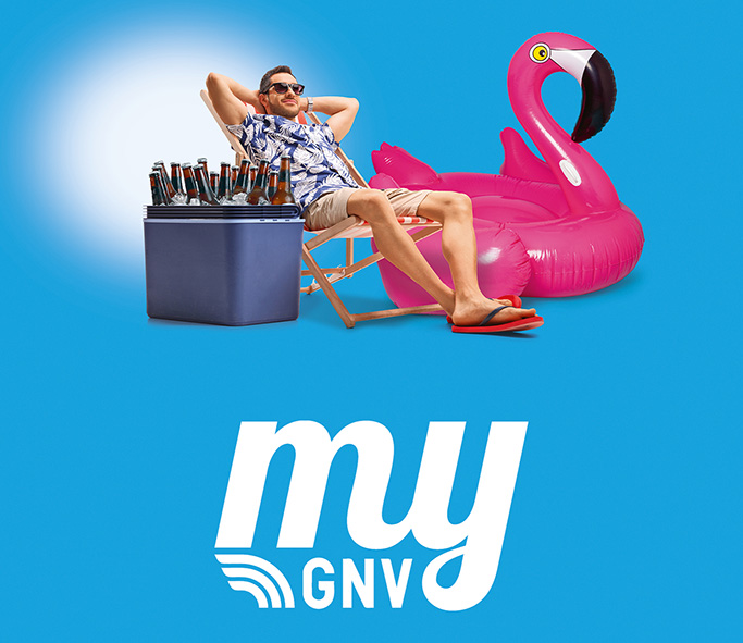
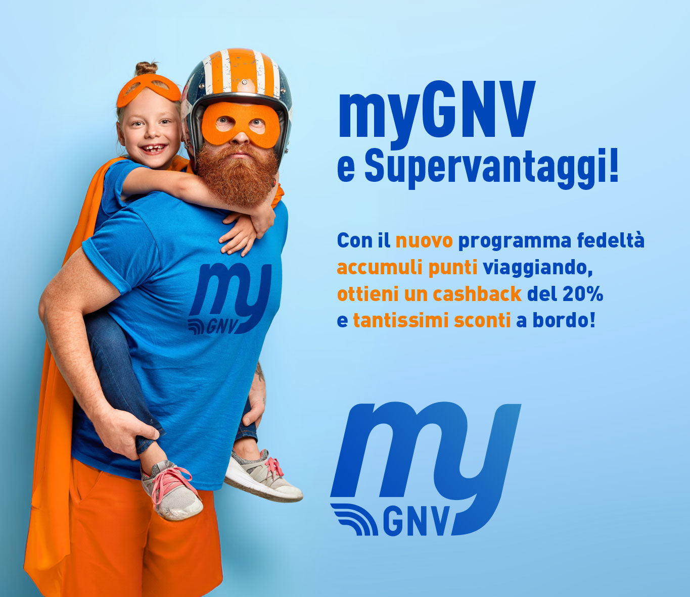
Next, we developed a new key visual that perfectly embodies the spirit of the myGNV program, focusing on a strong and familiar image that symbolizes protection, adventure, and the joy of traveling with GNV.
The identified claim “myGNV and super advantages” completes the campaign, clearly communicating to passengers the exclusive benefits and added value that the program offers.
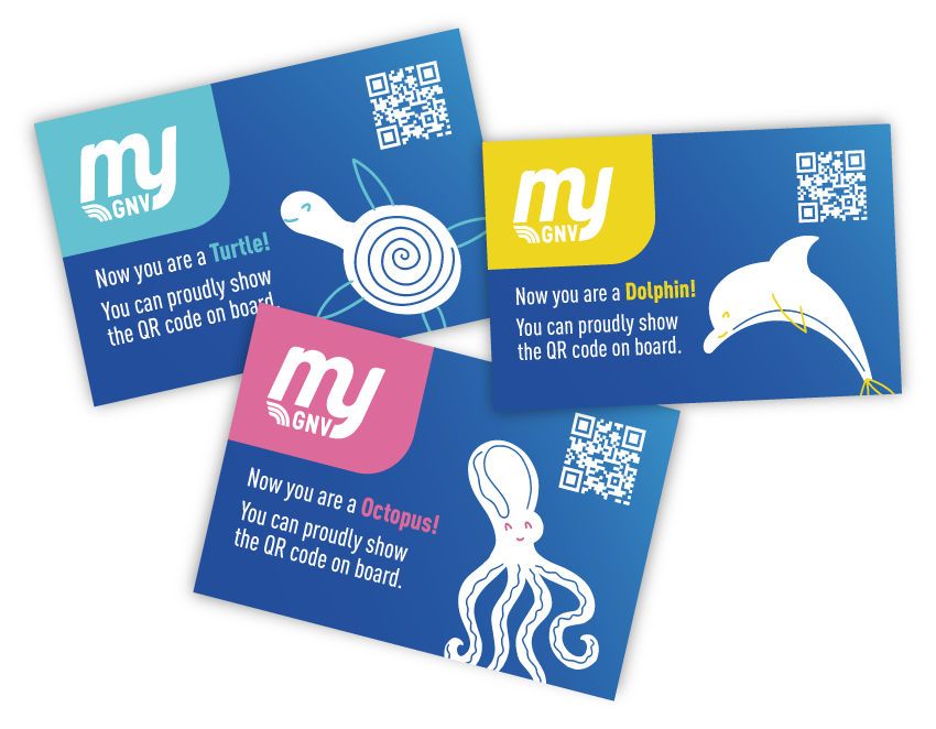
We also created the graphics and illustrations for the three loyalty cards that represent the program levels: “Turtle,” “Octopus,” and “Dolphin.” The cards, featuring cute and modern illustrations, represent the three marine animals, making each program level visually appealing and easily recognizable.
Along with the cards, we designed the icons present in the GNV customers’ private area, ensuring that every graphic element of the myGNV program is consistent and integrated, enhancing the user experience and making interaction with the program more intuitive and enjoyable.
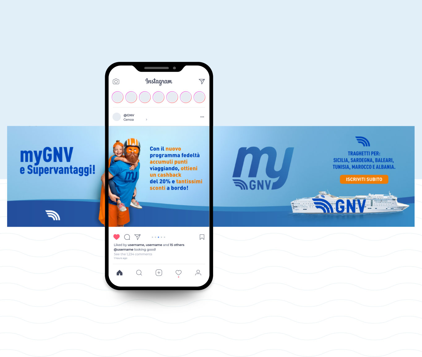
The key visual was applied across all digital and print materials, ensuring a consistent and recognizable presence of the myGNV program at every touchpoint. For the website, we created banners and sliders for the dedicated page, as well as social media posts for online promotion, guaranteeing optimal and engaging visibility.
The graphics for the monitors on board the ferries further reinforced the communication, keeping passengers informed about the program’s benefits during the journey.
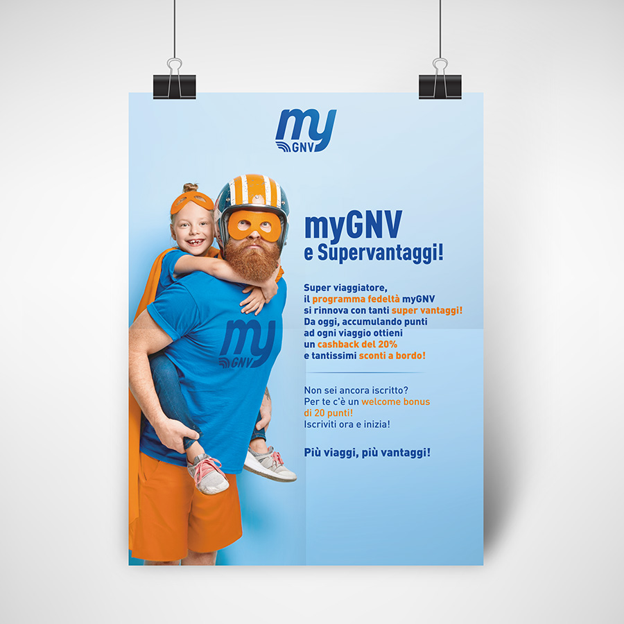
Regarding print materials, posters and displays for the ticket offices were produced, ensuring that every physical point of contact with customers was aligned with the image and message of the myGNV program.
Results
One month after the launch of the promotional campaign, myGNV has already generated significant interest among passengers. The renewed loyalty program has been well-received, and the new visual has made the brand more attractive. The visibility and clarity of the provided information have improved the overall customer experience.